The Redesign of Five Guys
Five Guys has a lot of potential, but this is not reflected at all in the design of the product packaging, which looks unpretentious and boring and also does not appeal to the viewer. The packaging materials are neither eye-catching nor are they used effectively in terms of design, which means that the chosen material cannot bring out its true potential.
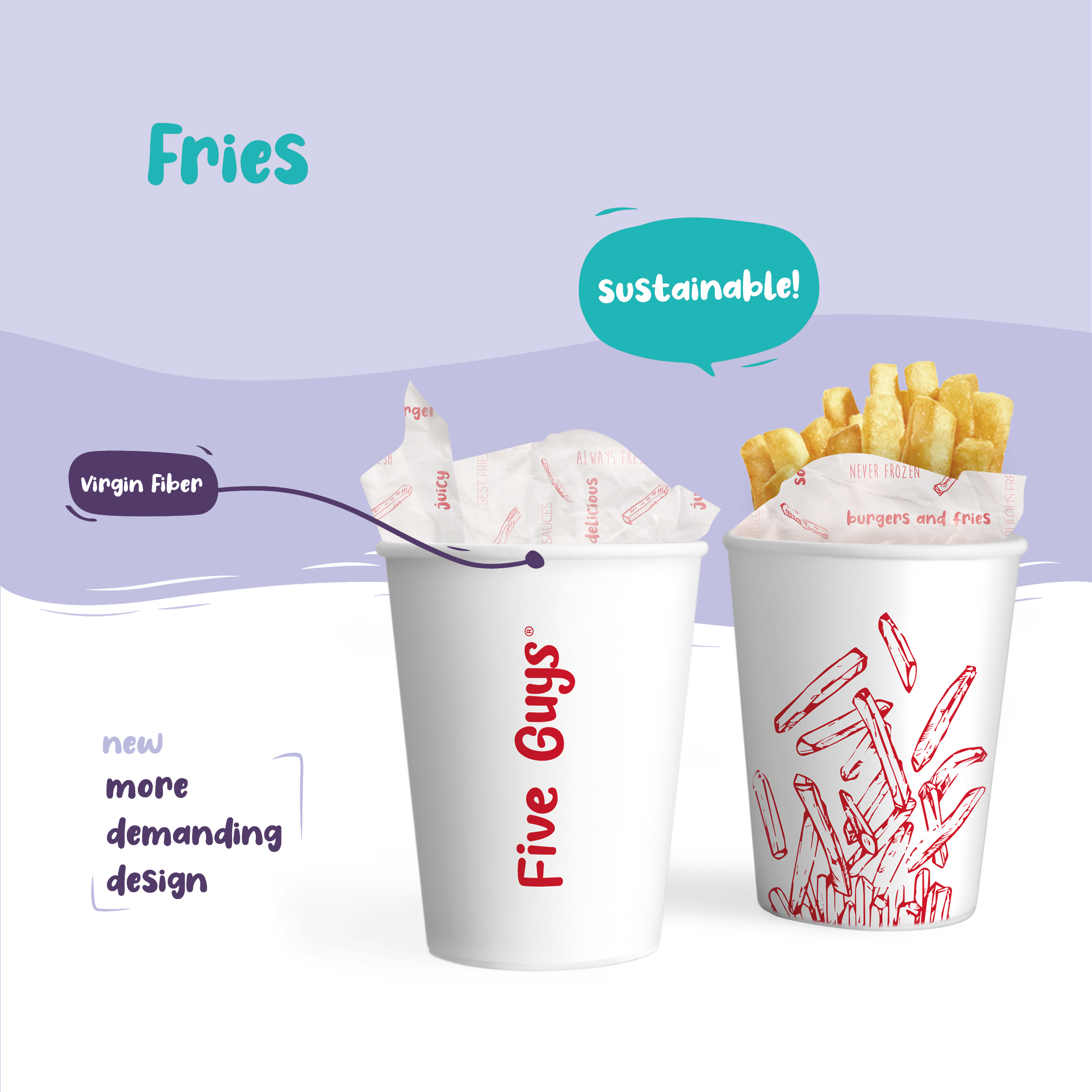
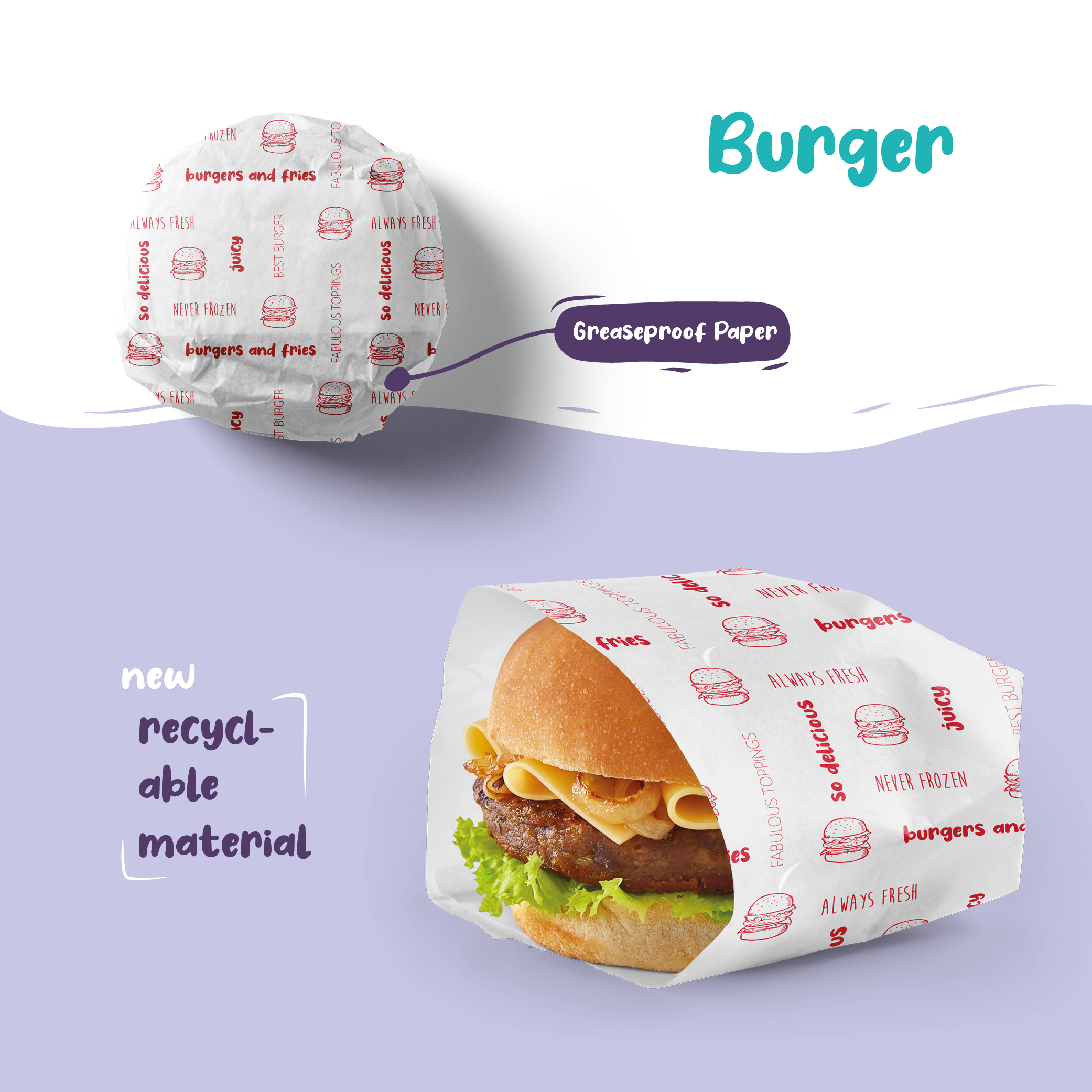
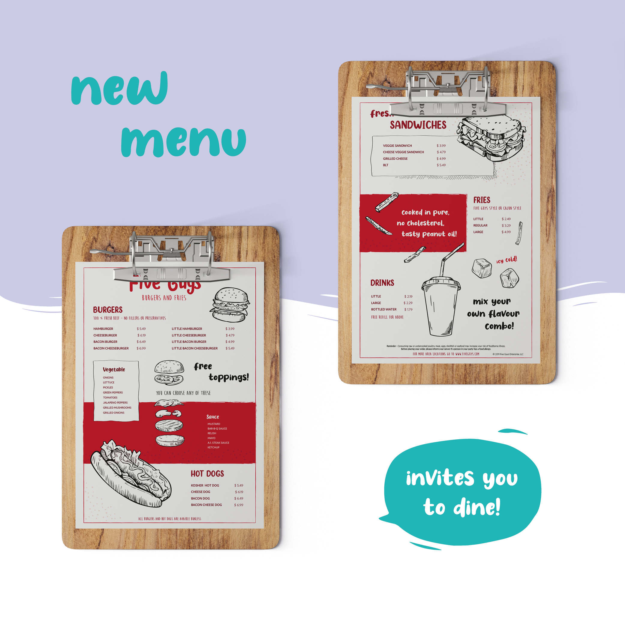
Food needs a presentation that whets the appetite! I therefore decided to develop a redesign for the packaging and the logo for this fast food chain. I worked with exciting, but also simple graphics and illustrations. For the color choice I referred to the original red tone. This color has a high recognition value in relation to Five Guys.
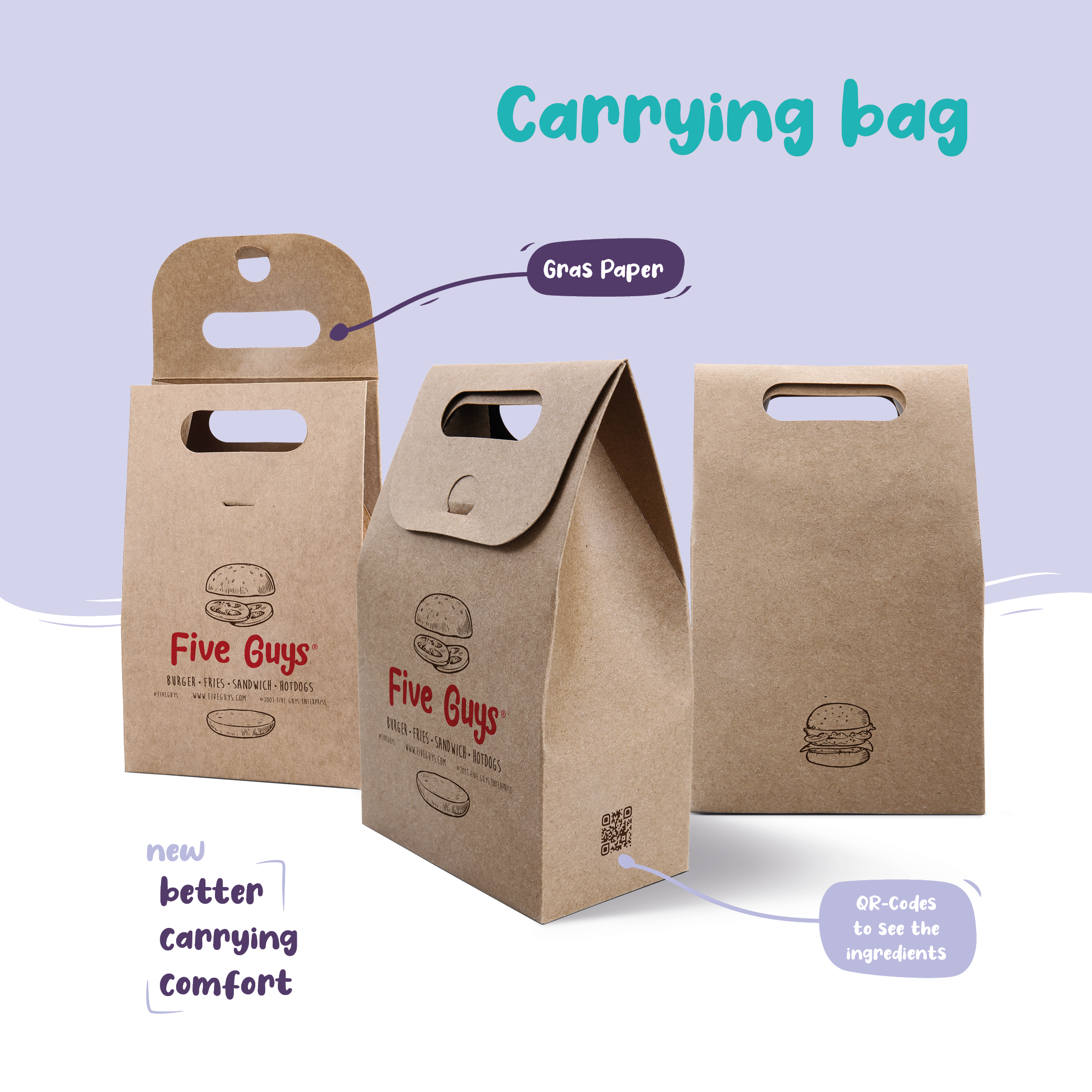
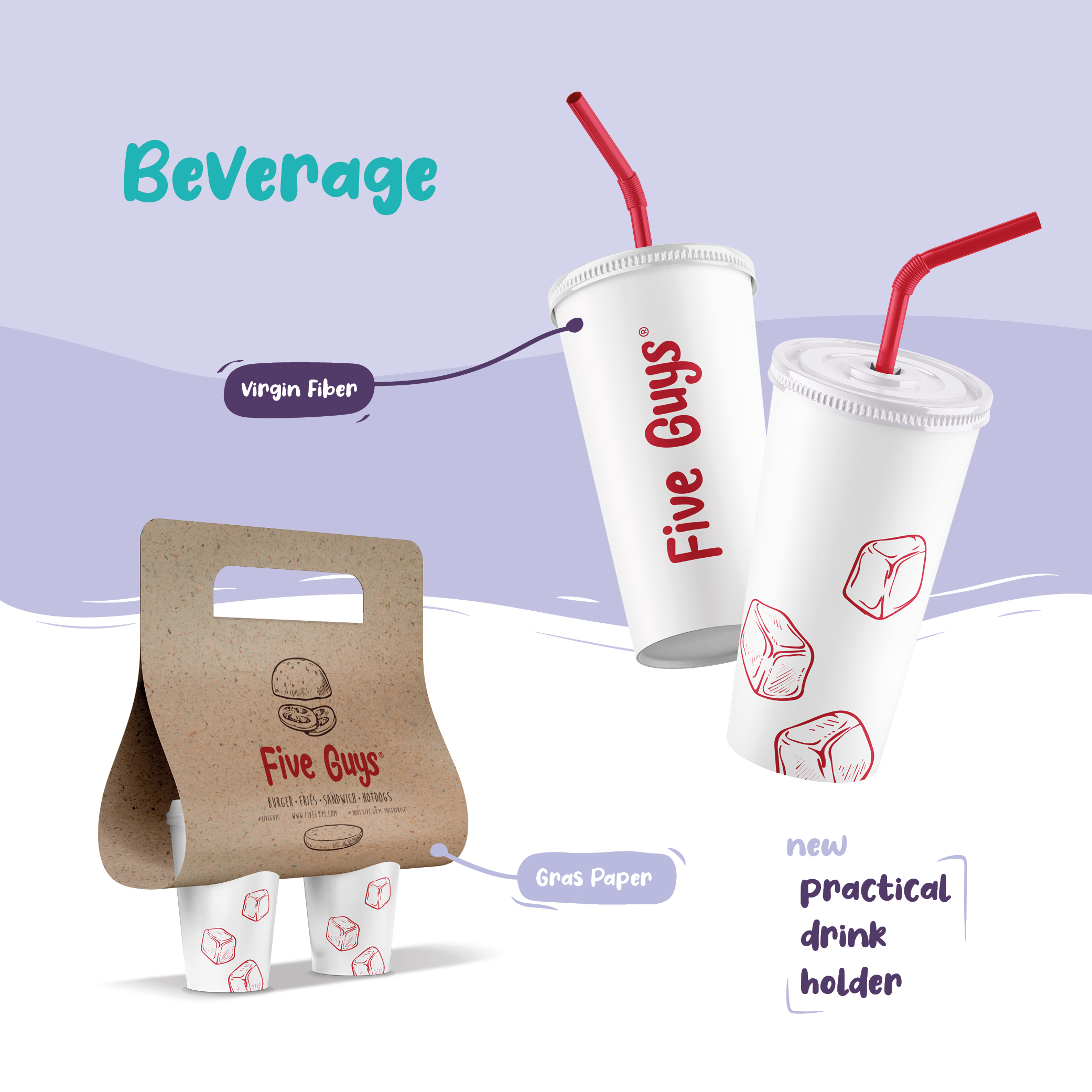
In order to satisfy the customers and make it comfortable to carry the purchased products, I made a hole in the carrying bag and also created a drink holder. The result is a packaging design that invites every member of the family to enjoy this delicious food in a more relaxed ambience.
